Cakes & Shakes
Brand Identity


Emma and Jake came to me with a dream—to create the ultimate go-to spot for teens and tweens craving epic shakes, Insta-worthy cakes, and a vibe as fresh as their menu. They weren’t just launching a café; they were building a full-on experience, a place where every sip, bite, and snap felt like pure joy.
Their vision?
Bright, playful, and packed with personality. They wanted a brand that felt as fun and energetic as their customers—something that would stand out on socials, bring in the weekend crowds, and make every visit feel like a mini celebration.
The brief? To craft an identity that was bold, vibrant, and unmistakably them. This brand needed to be more than just another café—it had to be a destination, a place where color, creativity, and community collide in the sweetest way possible.
The Challenge
At first glance, the goal for Emma and Jake’s café brand seemed simple: create something fun, fresh, and playful to attract their teen and tween audience. But as I dove into my (famously detailed) brand discovery process, it became clear that this wasn’t just about looking cool—it was about standing out, creating a true destination, and making sure the brand had staying power in a fast-moving, trend-driven space.
Here’s what I uncovered:
• A Brand for a Social Generation – Teens and tweens don’t just want a café; they want an experience—something worth sharing. The brand had to be visually exciting, packed with personality, and instantly recognisable, both in-store and online.
• Trendy Without Being Gimmicky – It’s easy to go overboard on bright colors and quirky fonts, but the key was balance. The brand needed to be playful and fun, but with a slick, intentional design that felt fresh rather than fleeting.
• A Space That Stands Out in a Crowded Market – The café world is packed with businesses chasing the same audience. Emma and Jake’s brand had to be more than just another “cool place to grab a shake”—it needed a distinct personality, a sense of community, and an identity that made people come back again and again.
Beyond just a logo and color palette, this was about creating a brand that had energy, heart, and a serious wow factor—one that didn’t just follow trends but set them. The challenge? To design something as unforgettable as the experience itself.


The Solution
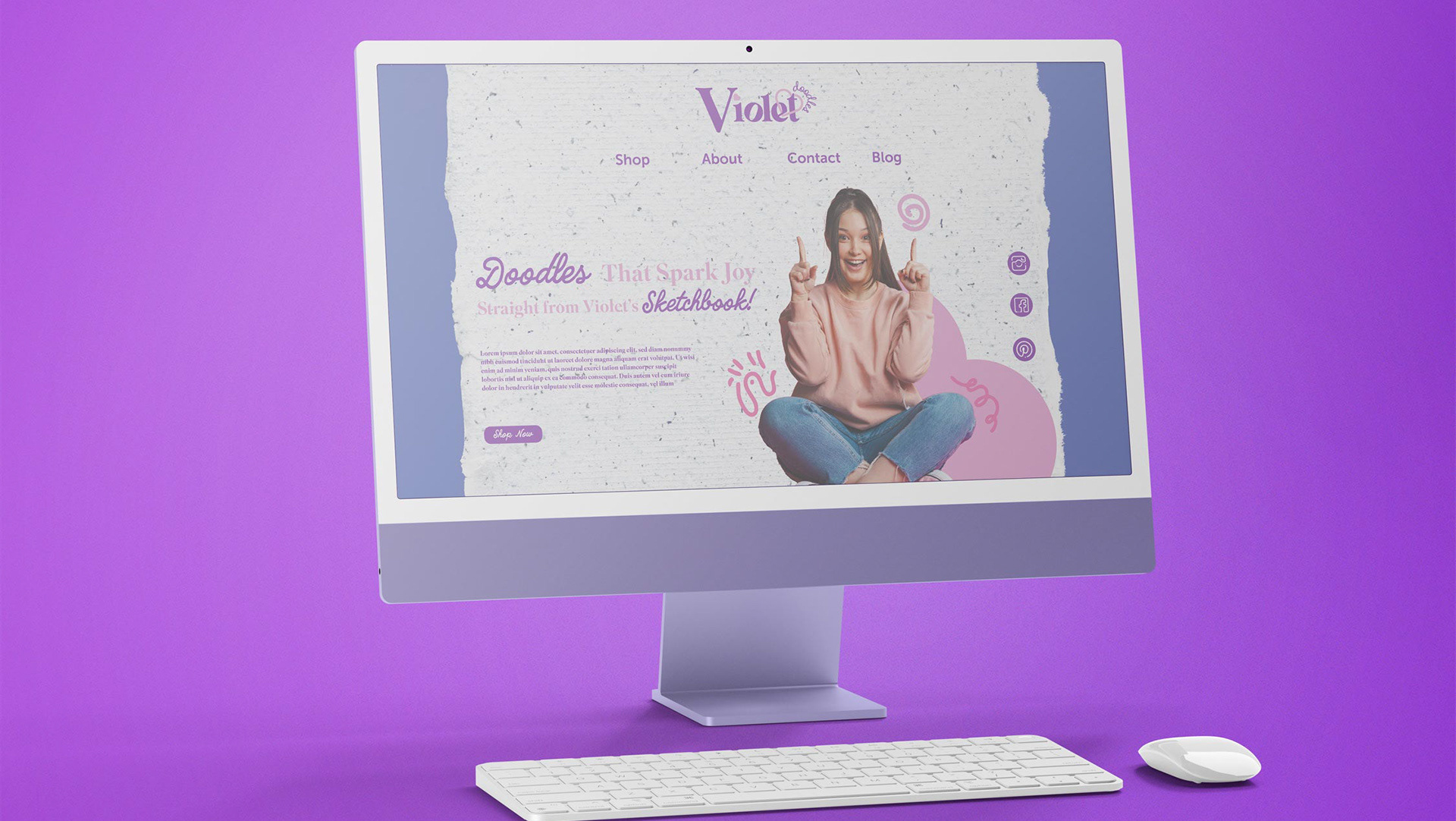
Cakes & Shakes needed a brand identity as bold and playful as its treats—a look that instantly grabs attention, sparks joy, and turns every visit into a shareable moment.
The Audience
Today’s teens and tweens aren’t just looking for a snack; they want an experience. They crave vibrant, Instagrammable spots where they can snap photos, hang out, and indulge in something fun. The brand needed to be eye-catching, energetic, and effortlessly cool—both in-store and online.
A Fresh & Playful Identity
To make Cakes & Shakes the ultimate sweet spot, I created a brand that blends boldness with approachability:
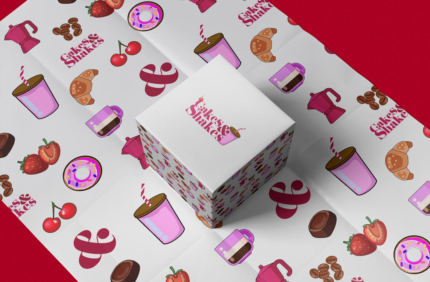
• A high-energy colour palette – Rich berry tones and vibrant pinks create a deliciously fun, eye-catching aesthetic that pops on signage, menus, and packaging.
• A modern, dynamic logo – A classic serif meets a playful ampersand and an illustrated shake, making the brand instantly recognisable and full of personality.
• A custom pattern system – Bespoke illustrations of cakes, shakes, and treats add a unique touch across packaging, menus, and social media, reinforcing the fun, youthful vibe.
Solving Key Business Challenges
• A Brand Built to Be Shared → The visual identity is made for the digital age—bold colours, playful patterns, and a design that turns every shake and dessert into a must-share moment.
• Trendy Without Being Temporary → The branding is fresh and youthful but designed with longevity in mind, ensuring it stays relevant as the business grows.
• Standing Out in a Crowded Market → Cakes & Shakes isn’t just another dessert café; it’s a destination. The branding transforms it into a place people want to visit, photograph, and talk about.
Creating a Destination, Not Just a Café
Beyond great design, the brand needed to feel exciting, welcoming, and full of personality—like stepping into a world of sweetness and colour. The result? A brand that doesn’t just serve cakes and shakes; it creates moments worth sharing.


Project Round-Up:
This project wasn’t just about designing a brand—it was about creating a fun, energetic, and crave-worthy experience that turns every visit into a celebration. Every design choice was made with a clear goal: to capture the joy of indulgence, spark instant brand recognition, and position Cakes & Shakes as the go-to destination for sweet treats.
The final result?
A bold, playful, and highly shareable brand that:
• Instantly stands out with a vibrant, mouthwatering colour palette and a dynamic logo that embodies the fun and flavour of the brand.
• Feels custom and memorable through bespoke illustrations, ensuring every brand touchpoint—from menus to packaging—feels unique and Instagram-ready.
• Turns Cakes & Shakes into more than just a café—it’s a destination where customers don’t just grab a shake; they capture a moment.
• Creates a seamless experience across digital and physical spaces, making the brand instantly recognisable whether in-store, on social media, or in takeaway packaging.
Now, Cakes & Shakes isn’t just serving desserts—it’s serving fun, nostalgia, and an irresistible experience that customers can’t wait to share. 🍰🥤✨